MY LOGO DESIGN PROCESS
FOLLOW ALONG AS I CREATE A NEW LOGO FROM START TO FINISH
Designing a logo is my favorite part of being an artist. The challenge of creating a tiny little graphic which will become the face of a business excites me. A successful logo design needs to communicate its message and be super versatile. It will need to work in black or white only. It will need to work very tiny for social media and online purposes. A “fabicon” is only an one eighth of an inch big and you might need one! I’ve been designing logo’s for over 30 years, this is my 7 step process to ensure my customers are getting a great design that is easily usable for all of their needs.
STEP 1: THE CREATIVE BRIEF
Pretty self explanatory, the creative brief is a statement created by myself and the client addressing the scope and goals of the project. Below is the brief for a logo and branding design project:
NEW RESTAURANT CREATIVE BRIEF
Name, design the logo, and create branding for an upscale Mexican fusion restaurant and tequila bar in Silverton, Or. The menu will feature traditional Mexican fare done with a modern, spicier, twist. All the meats and veggies will be locally sourced and will include some not so common items such as deer, and bison. The restaurant experience needs to be exciting, unique, a challenge, something you don’t get often - think Hell’s kitchen. Dare to have the food experience of a lifetime. The drink menu’s will feature top shelf spirit cocktails and small batch wines from central, south America, and locally. The logo should feel like a big city, 5-star restaurant, a destination and a luxury brand.
STEP 2: GATHER INFORMATION
I have a tailored online question list for my clients upon starting a logo design. I won’t talk about what’s on the list because its very unique and many of the questions will surprise you, its actually fun for the client (see, already you’re bonding with your brand!). I use the info on that questionnaire to look at competitors and similar brands and figure out how I can make this brand unique to the world, and have deep meaning for the owner and employees.
STEP 3: WORD MAPPING
Step three and finally some creative thinking starts. Stop and think about that for a moment, every thing else has been fact finding and soul searching - the kind of stuff that makes a logo or brand have emotional pull. Ok back to word mapping. Its a great simple way get the brain in “the zone” and discover imagery and thought trends. I start with 3-7 words, and basically play word association working outwardly. The word mapping for the restaurant job helped define a great name that would be easy to design a visual brand around as you’ll see.
From the above word mapping I found the following theme’s that were matching all three criteria: Deer, Silver, Art, Culture,
STEP 4: SKETCHING, FINALLY!
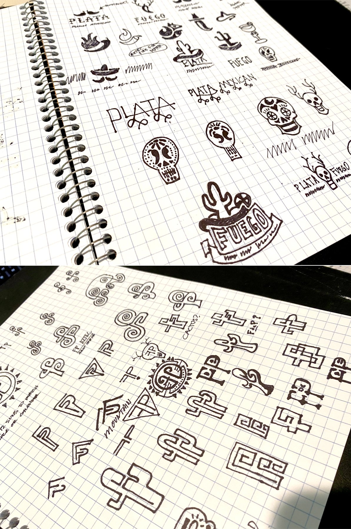
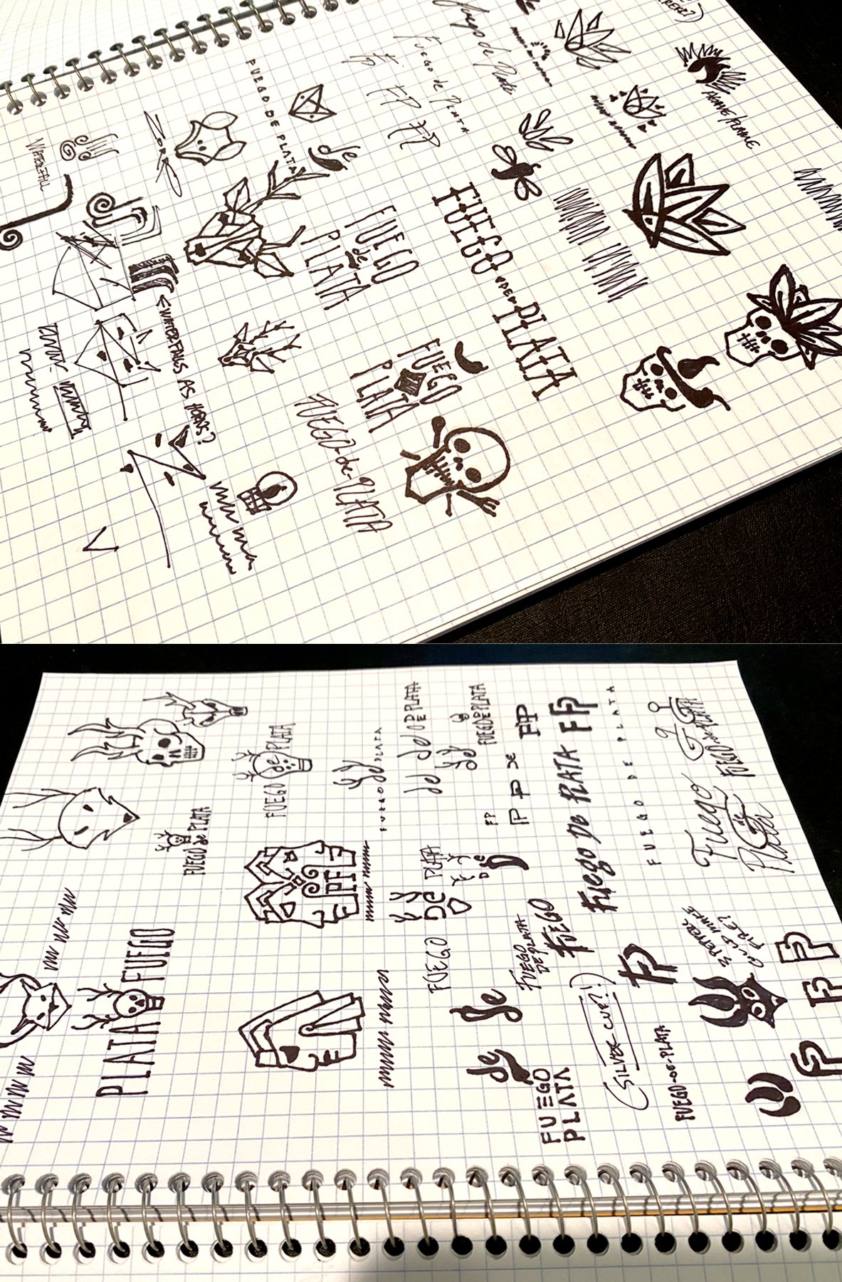
At this point ideas are flowing and I’m eager to start sketching. The sketching phase isn’t about quality, its about quantity and exploring ideas, even bad ones. For this job we were still discussing the name of the restaurant and planned to use the sketches to help narrow down the name options. We soon agreed that Fuego De Plata, or Silver Fire, was a brilliant name and paired it with the phrase Bienvenido al Fuego, or Welcome to the Fire. It is upscale, exclusive, daring, spicy, and allowed for great visual options.
STEP 5: DIGITAL DESIGNS
Now I’m excited to see how these ideas translate into digital form. I have dozens of great sketches to work with and dozens of ideas in my head about how some of these concepts might pair well with other sketches to say even more. We’ve learned from this that some sort of animal is important, horns are exciting, peppers and fire. The first batch of designs looked good and had potential, the sugar skull with antlers is very cool, a pepper shaped as a pan is great, and horns on a pepper are cool option.
Although I was sure the answer would come quickly I wasn’t all that impressed with the first designs and needed to think deeper. I hadn’t explored very many typography options yet so I scanned back through the sketches and found a few other concepts to explore. One was using a waterfall graphic as the horns on a fox which I later tried to morph into the letters P and F. I had also wondered if I flipped the image horizontally would it become an aztec animal sculpture?
So it was back to the digital world to see if these images could be blended. Eventually I hit on some key design elements - a hot tongue sticking out, an intimidating beast, fire or heat coming off the head, culture and a story and a logo was born!
STEP 6: REFINE & FINALIZE THE DESIGN
In this stage I will rebuild most of the logo to ensure that every curve matches every other curve, that everything is of equal proportion and clean as a whistle. The lettering will be expert typeset, paying attention to every letter shape, and the negative spaces between letters (kerning) for consistent spacing. Our brains are programed to prefer symmetry and nicely shaped things, and our brains are programed to dislike bad lettering - mine more than others perhaps - but that’s why I’m the pro.
Once the design is done I will mock up some branding examples to show how it will be used. I can even manage the production of your branded items if needed.
STEP 7: DELIVER
With any logo I design, the client gets a customized “Logo Usage Guide”. This guide contains over 50 versions of the logo and explains how, when, and why, to use each version. It also shows your brands color pallet and font usage. It can be forwarded to any vendor and they will understand how to use your logos. Need some hats made with your logo? Just forward your brand guide packet to your hat maker, they’ll know what to do.


